Tableau dashboards by Aslane Samai
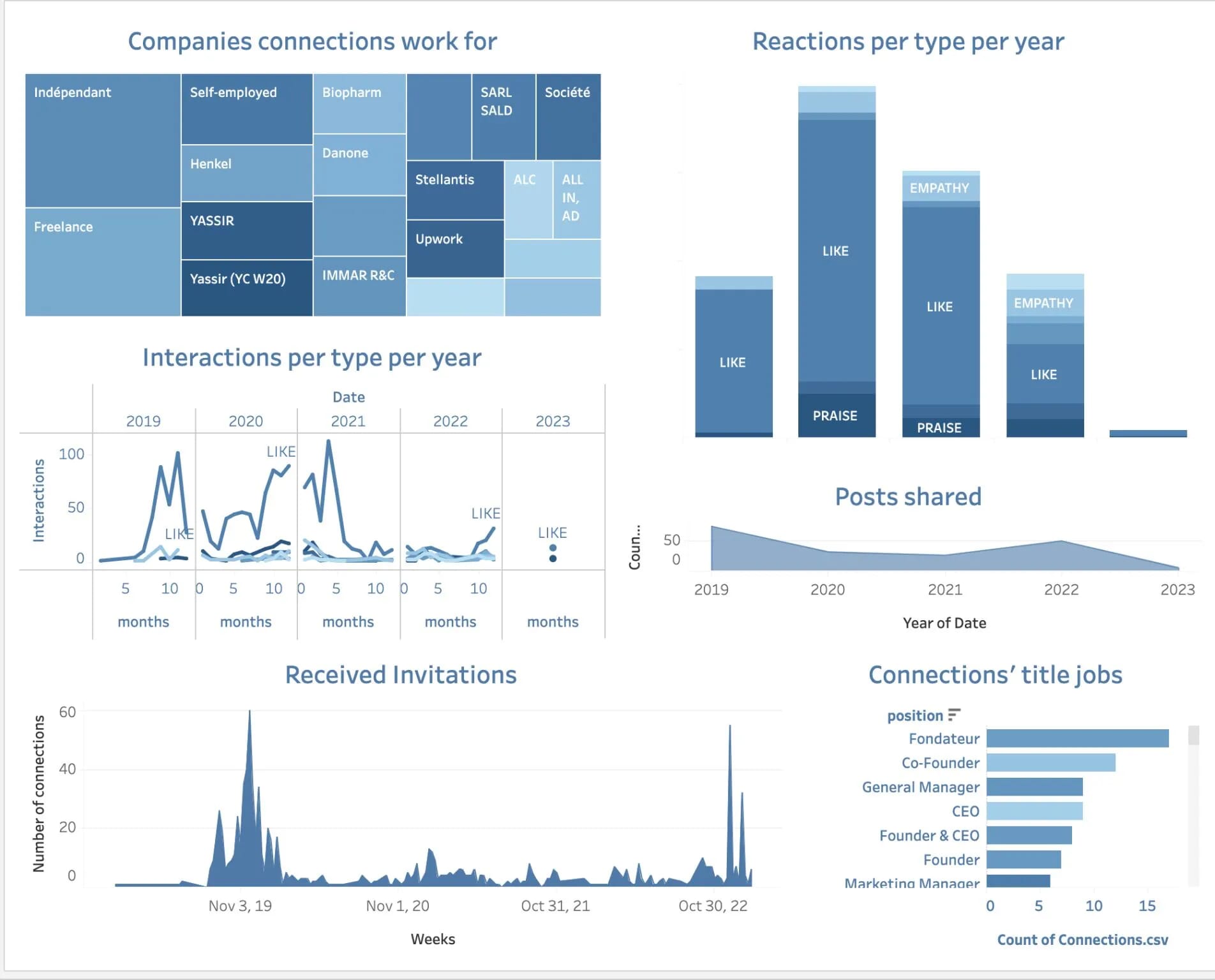
1. My Piece de Resistance: My LinkedIn Profile Data
I use LinkedIn a lot! Probably more than I should ☹️ Making a dashboard out of my interactions, my connections, and what have you kinda made sense to me.
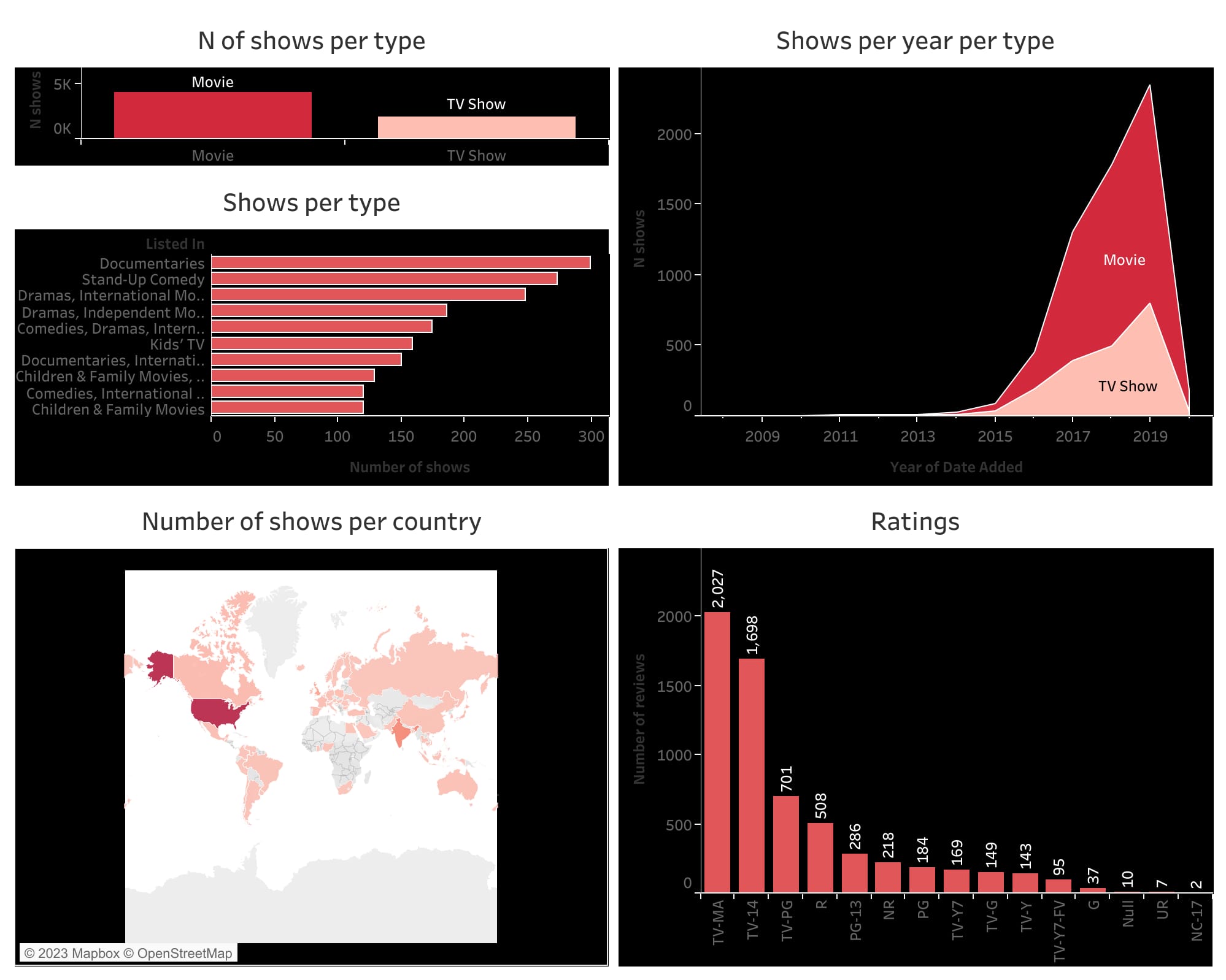
2. Netflix Around the World
Tv shows are dead, all hail adult movies 🔞🫣 How do I know that? I analyzed Netflix data around the world! Here’s what I found out:
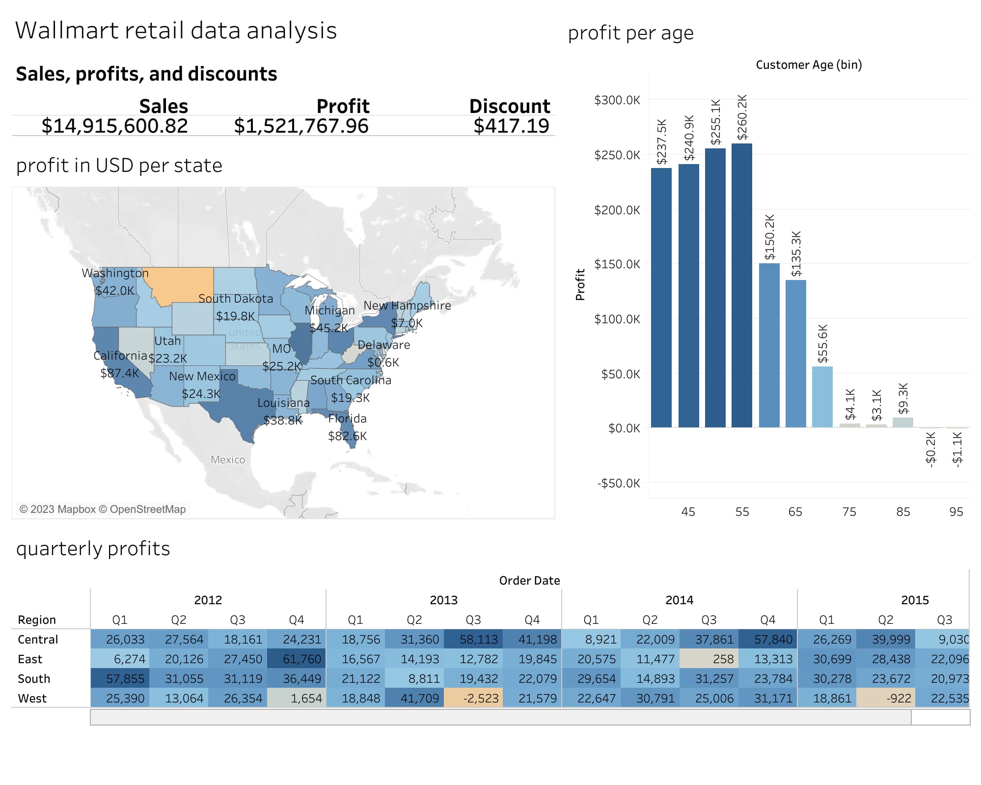
3. Walmart Across the US
Talking about juggernauts, Walmart is the biggest retailer in the US (as of writing this, Amazon is tailgating 😄). But its performance varies across the 50 states.
Here’s a dashboard with its performance between 2012 and 2015 as well as profits per age (Gen Z apparently hasn’t even heard of the retailer. But that’s expected since they prefer, well, more luxurious items).
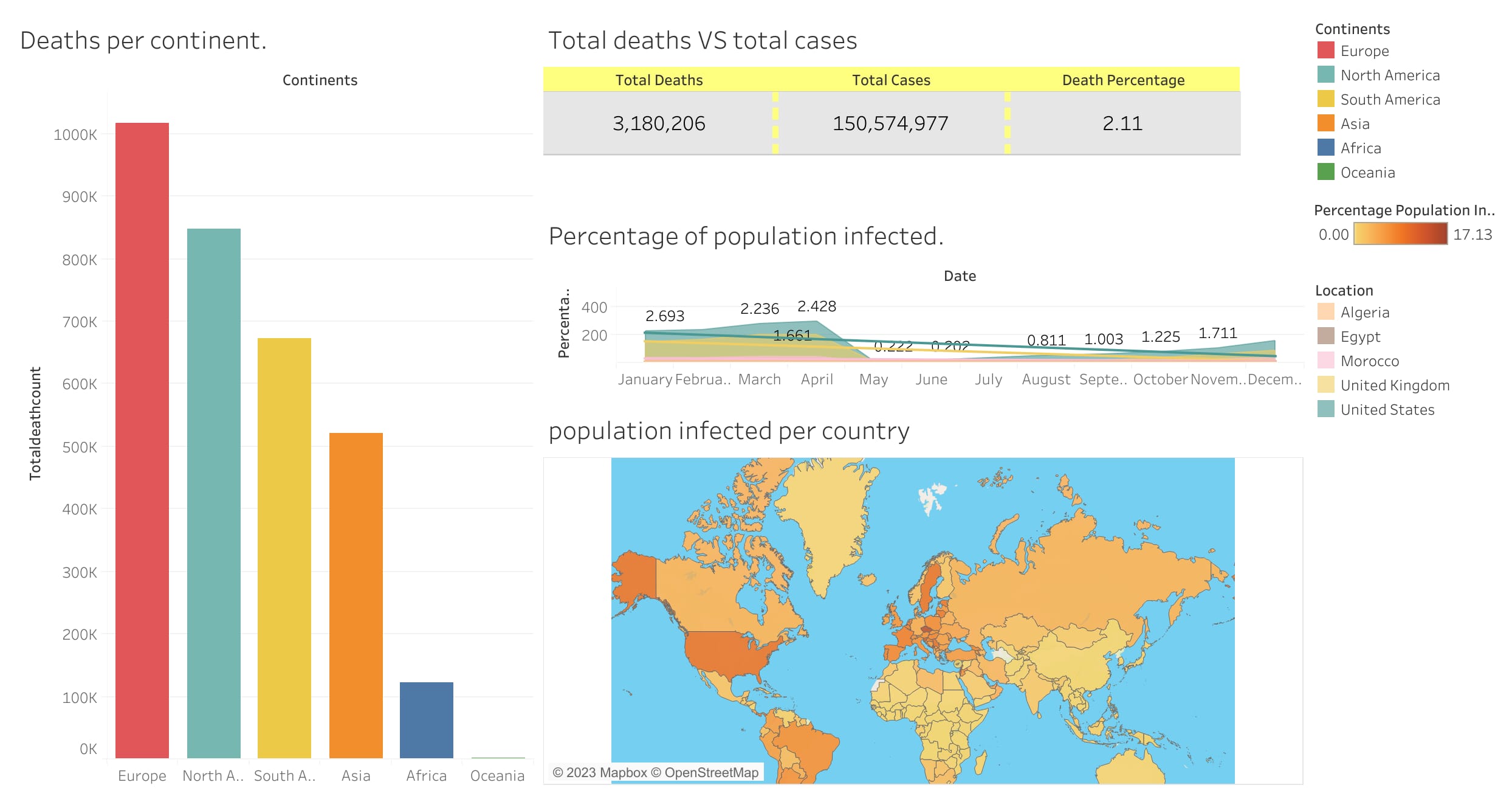
4. Covid Deaths per Country
In retrospect, this one is kind of ugly. But I’m not changing it because 1) It’s the first dashboard I built, and it holds a special place in my heart. And 2) It’s about Covid deaths, it does not have to be cheerful.
That said, I enjoyed working on it. And I learned a lot about Covid and its impact around the world.
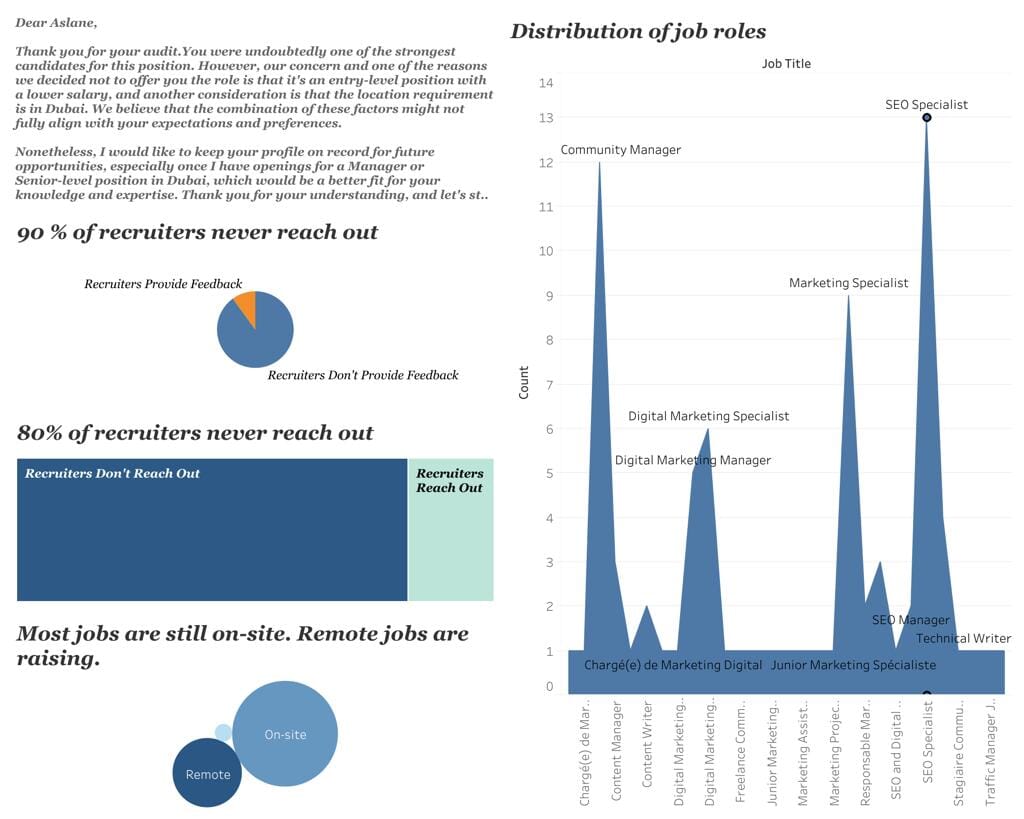
5. Job rejections. My job rejections...
Job rejections are part of the process. But it's hard to not take them personnaly, especially when you get so many of them. Which I did. So intead of feeling bad and rehashing all the NOs I got, I decided to make a Tableau dashboard out of them. Because it's fun and data is beautiful. I also needed a distraction but that's another story for another day.
This dashboard is the initial version, I have no doubt I will be updating it soon.
All right, that’s a wrap! These are 4 dashboards I’m not completely ashamed of showing to the few stray cats that might come across my website.